Bootstrap 4
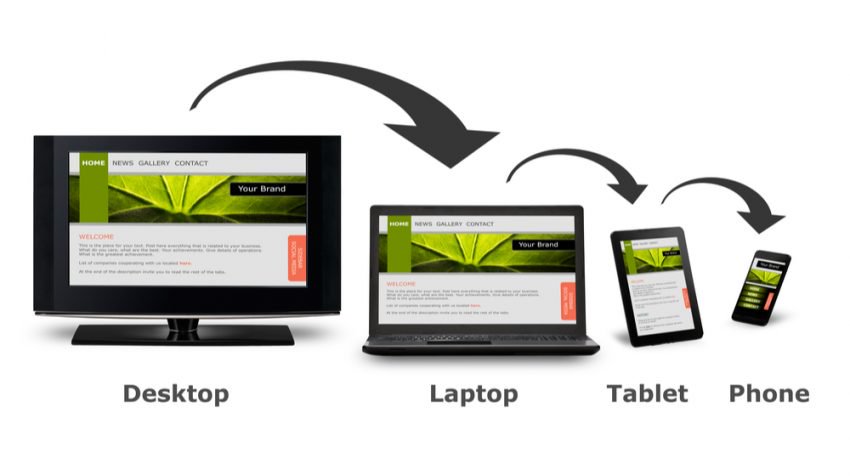
Responsive web design is an approach to web design that makes web pages render well on a variety of devices and window or screen sizes (desktops, tablets, and phones).
Bootstrap
Originally created by a designer and a developer at Twitter, Bootstrap has become one of the most popular front-end frameworks and open source projects in the world. It is the most popular HTML, CSS, and JS framework to use for Responsive Web sites and Web applications.
Responsive Web Design - Media Queries
Media query is a CSS technique introduced in CSS3.
It uses the @media rule to include a block of CSS properties only if a certain condition is true.
Example of @media
                        /*media query*/

                        /*Extra small*/

                        @media only screen and  (max-width:
                        576px) {

                           .carousel {

                               transform : scale(0.5);

                           }

                           .slides {

                               right: 50%;

                           }

                        }

                        /*medium - portrait*/

                        @media (min-width:577px) and (
                         max-width: 767px) {

                           .carousel {

                               transform: scale(0.7);

                           }

                           .slides {

                               right: 30%;

                           }

                        }

                        /*medium - landscape*/

                        @media (min-width:768px) and (
                        max-width: 991px) {

                           .carousel {

                               transform: scale(0.9);

                           }

                           .slides {

                               right: 10%;

                           }

                        }

                        /*lagre and extra lagre*/

                        @media only screen and (min-width
                        : 991px) {

                        }


